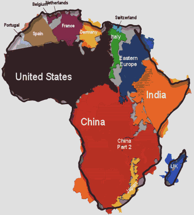
You wouldn’t know it by looking at present day maps, but Africa is so large that it can fit the entirety of the US, all of China, India, as well as Japan and pretty much all of Europe…all combined. German graphics designer Kai Krause has produced a map to illustrate the true size and reshape the world’s opinion.
Courtesy Kai Krause
IFLScience notes why clearing up the perception is extremely important given the recent Ebola crisis:
Krause initially released the map years ago, achieving a burst of fame. The image has come back into the spotlight with a renewed relevance recently; the Ebola crisis has led to panic about visiting Africa. Any part of Africa. Tourism in Cape Town and solar installations in Tanzania have been affected because people are scared to fly to those places, despite the fact that Paris is actually closer to the countries with an Ebola outbreak than either of them.
The responses below are not provided or commissioned by the bank advertiser. Responses have not been reviewed, approved or otherwise endorsed by the bank advertiser. It is not the bank advertiser's responsibility to ensure all posts and/or questions are answered.

1 comment
I should like very much the figures of inhabitants of the countries contributed next to the names of the different countries.
By the way, survival of mankind will not succeed without climate engineering. The way best is copied from nature itself. If you like to know how, please contact me. Jotfried@Gmail.com