2.9K
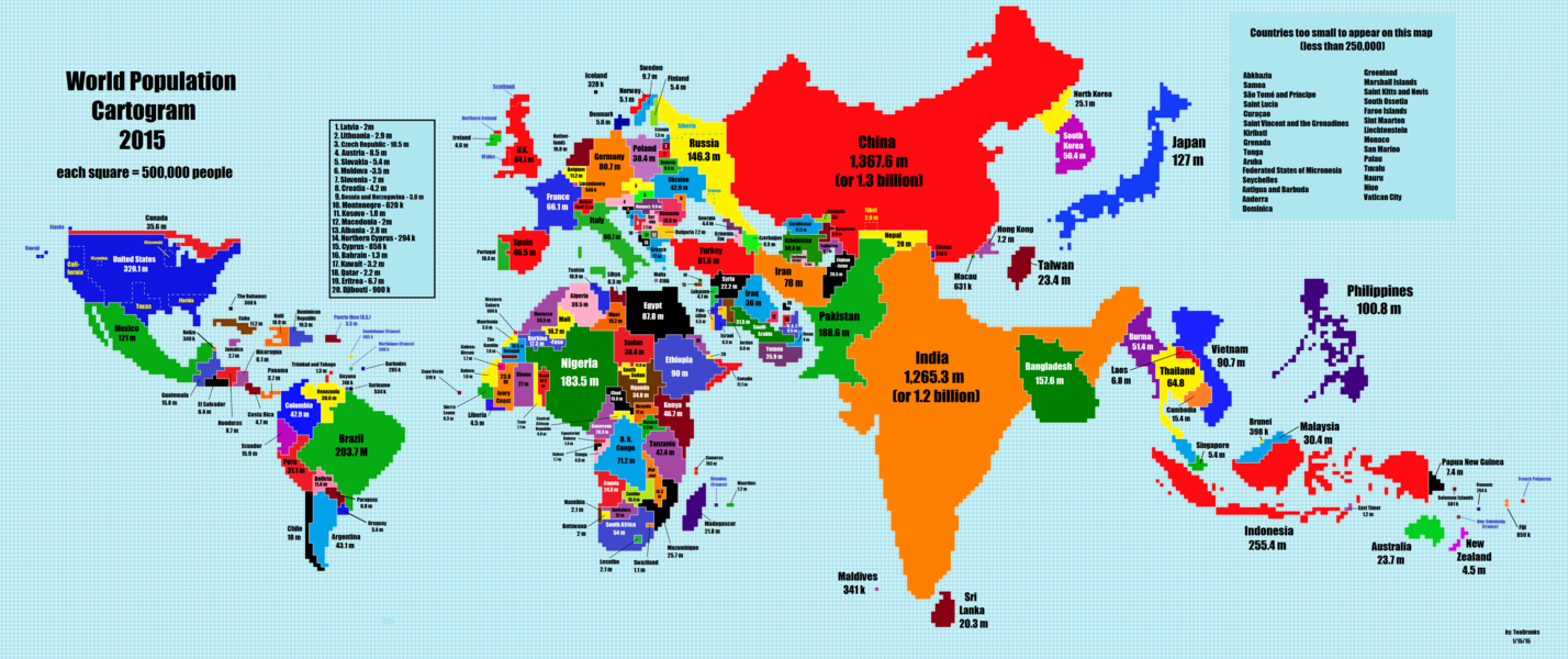
What if country size on a map was relative to population? Reddit user TeaDranks shared the following cartogram where each square represents 500,000 people. China and India dominate the map while Brazil and Nigeria are much larger than we are used to seeing. Hong Kong and Taiwan are featured more prominently while Canada, Russia, and Australia are surprisingly small.
Click here for a clean zoomable version of the map.
The responses below are not provided or commissioned by the bank advertiser. Responses have not been reviewed, approved or otherwise endorsed by the bank advertiser. It is not the bank advertiser's responsibility to ensure all posts and/or questions are answered.