Yesterday, United officially unveiled the public beta version of their updated site, which select MileagePlus members have already been testing for the last few months.
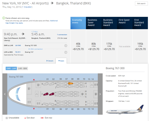
If you use the United App, you should already be familiar with much of the functionality. What are your thoughts? I always liked the award search functionality on UA/CO more so than any other legacy US carrier…and I’m happy to say that I still like it the best (though scrolling through my award options seemed easier via the matrix display on the old site). I’m still looking for any functionality missing from the old site, but overall I’m finding the beta version to be modern and responsive.
Will you miss the legacy Continental site that’s been around for so many years?
From the PR:
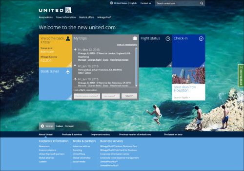
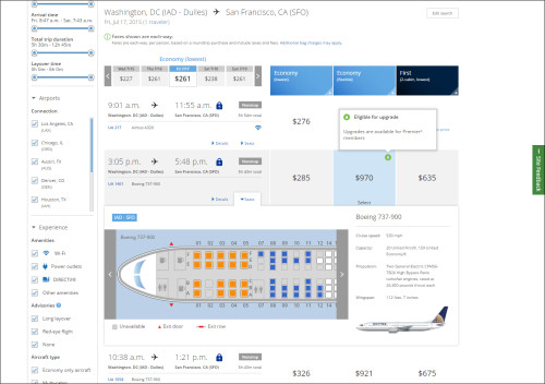
United Airlines today unveiled the beta version of the company’s new homepage and flight booking features for united.com – encompassing everything from searching and sorting flight options to reserving and buying tickets. The site offers a sleek, modern and touch-friendly design, along with all-new personalized features and tools to help customers select the best flights and travel options to meet their needs.
Customers can browse and book on the preview site by visiting beta.united.com. The airline will officially launch the new united.com this summer after additional customer feedback and further refinements.
The new flyer-friendly functionality includes:
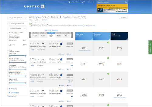
- Search, sort and filter your perfect flight: Customers can choose what’s most important to them when booking a flight. Whether it’s Wi-Fi availability, preferred connection cities, aircraft type, in-seat power or the inclusion of nearby cities, customers can sort, filter, include and exclude a variety of preferences to narrow or expand search results.
- Quicker view of fare and date combinations: Search results automatically display pricing for a 15-day window (7 +/-) to show customers more options, and fares are displayed in “each way” increments to give customers added flexibility and clarity when building their travel itineraries.
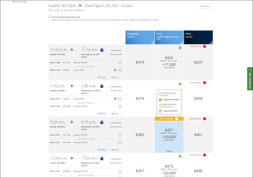
- Upgrade insight: Knowing if upgrades are available for purchase on a particular flight helps customers make more informed booking decisions. Customers can now view upgrade availability and redeem any MileagePlus upgrade prior to purchase on all eligible flights.
- Widgets working for you: The new homepage features widgets customized to MileagePlus members’ travel histories including a quick-view of upcoming trips, saved searches and alerts, to name a few. (Bonus: Users can select travel and aviation-themed photography for their homepage backgrounds.)
- Touch-friendly: No matter the device style or device brand, customers will have a seamless, touch-friendly user experience.
“We reimagined the flight booking experience from the ground up,” said Scott Wilson, United’s vice president of merchandising and eCommerce. “Much more than a facelift – we kept our customers’ needs and preferences for personalized travel at the center of the design to offer an entirely new and improved experience altogether.”
In redesigning the site, United also used feedback from customers to improve the features they valued most, making those tools cleaner and easier to use.
United.com by the Numbers:
2,000 visitors per minute
More than $1 million in revenue every hour
Offers flights on more than 100 airlines – the most of any U.S. carrier website
More than 1,400 destinations available
The responses below are not provided or commissioned by the bank advertiser. Responses have not been reviewed, approved or otherwise endorsed by the bank advertiser. It is not the bank advertiser's responsibility to ensure all posts and/or questions are answered.
1 comment
[…] reported that United is in the process of launching a re-designed website last week, and it look like another Star Alliance partner, Singapore Airlines, is also […]